BIZX MOBILE APP USABILITY TESTING
Purpose
I led the beta usability testing for BizX's new release of their mobile app. The purpose of the testing was to uncover any flaws in the design with real BizX members before releasing the app. At the end of my testing I created a document of findings and recommendations.

Background
BizX is a financial technology company that operates its own digital currency that facilitates business-to-business exchanges of goods and services. The current problem with BizX was that its online marketplace did not offer a very friendly and easy way to find members, and it was hard to tell which company accepted the BizX dollar. This app was created to connect all of the members in the BizX network so that they can find each other and spend with ease on their own, without having to call member services.
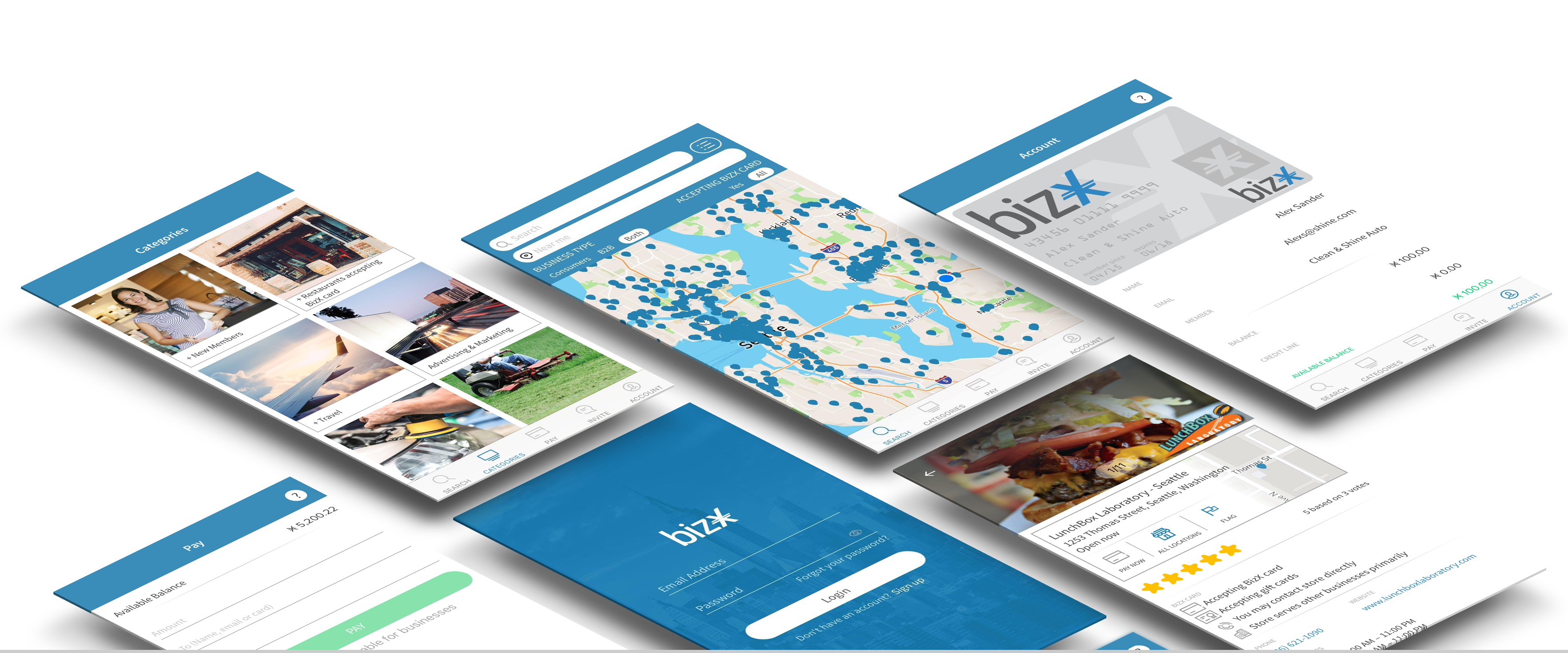
The app has 6 main features:
- Search: Allows members to find other members near them
- Map: Allows members to switch from a list results view, to a map view and route to the business' address
- Store: Allows members to view business' hours, location, if they accept the BizX card or not, flag a member, and view ratings
- Pay: Allows members to pay each other directly
- Account: Allows members to view a digital version of their card and view their transaction history
- Invite: Allows members to refer other businesses to join the BizX community
My Process
I first came up with a project proposal which defined the target group, what features I wanted to test, my method of testing and how I would measure the results. Then I came up with a project timeline and a test kit, which included the moderator's script and any sheets needed to be given to the participant (consent form, questionnaires, etc.)
Recruitment
I recruited 5 participants by making sure to get a range of people of different ages, genders, business types, and technological expertise. I created a list of desired members based on these, and gave it to our member care team who helped me contact them. We rewarded our participants with 100 dollar BizX gift certificates.
My participants included: a female photographer, a male accountant, a male sales coach, a male event rentals owner, and a male who owns a cloud phone service company, ranging from ages 31 to 54.
Testing
My process for the testing the usability of anything always roots from Whitney Quesenbery's five E's of usability:
- Is the app effective?
- Is the app efficient?
- Is the app engaging?
- Is the app easy to learn?
- Is the app error tolerant?
I carried out the testing in BizX's small conference room, setup with a laptop hooked up to a webcam running Lookback.io to record the user during testing. The laptop also had Lookback.io installed, which recorded the phone screen as the user is navigating the app.
I used a talk-out-loud approach to the testing - to allow the user to voice any opinions and struggles they had using the app. I refrained from answering any questions in-depth and allowed the user to fail, as to learn where the design flaws were. After each task, I had the user fill out a post-task questionnaire to rate the feature associated with the task for each of the 5 E's of usability.
Result
Quantitative feedback came from the averages of all of the participants' ratings for the questions focused around the 5 E's of usability, as well as the time it took them to complete tasks. Qualitative feedback came from the participant's comments and facial expressions.
I organized the findings by finding common themes amongst the participants and organizing them from most common to least common. After this, I organized them again in priority of importance of the change. The total findings came to 27, which I created design recommendations for each of them. The formal report I cannot release due to private company property, but this document was handed off to upper management for approval and we plan to do iterations of the app based on this.
DOCS CREATED Findings and recommendations document
TOOLS USED Lookback.io