USABILITY OF LIVING VOTER'S GUIDE
Purpose
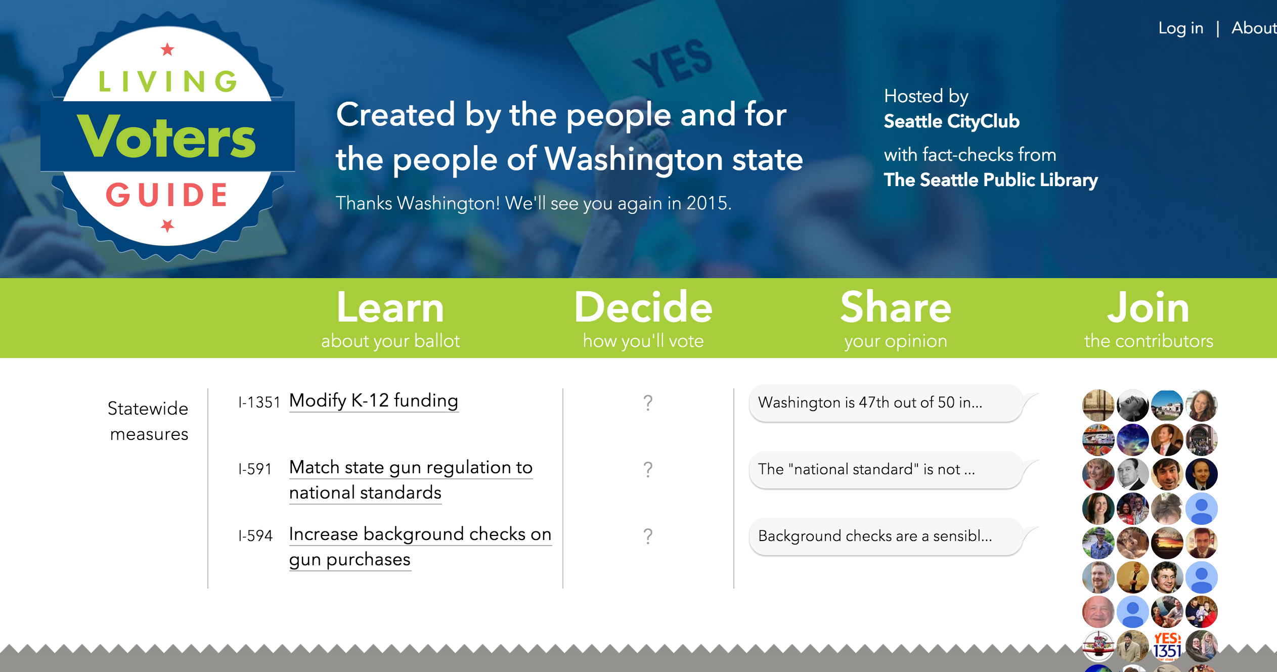
The purpose of our project was to test the usability of the Living Voters Guide, a website that allows users to learn more about bills in upcoming election or what their community thinks about those bills, and hopefully help the user forumulate an opinion.
Our Process
We wanted to answer the following five core research questions:
- Is the website effective?
- Is the website efficient?
- Is the website engaging?
- Is the website easy to learn?
- Is the website error tolerant?
We first came up with a project proposal which defined the target group, what we are looking for, and our method.Then we came up with a project timeline and a test kit which included the moderator's script and any sheets needed to be given to the participant (consent form, questionairres, etc.) We recruited our participants through a screener survey through Google forms.
Usability Testing
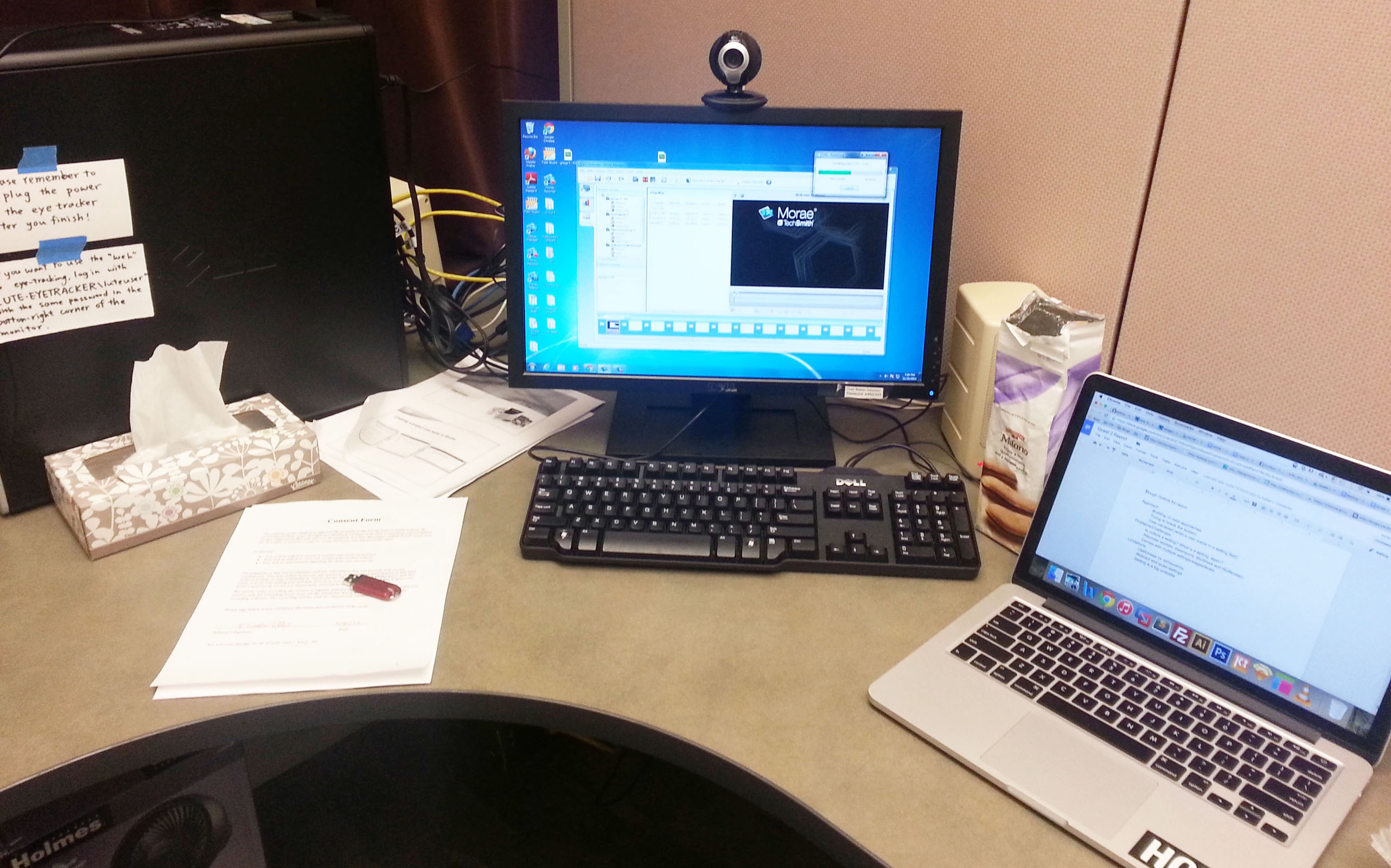
Our method for testing was an in-person moderated approach. We tested in the Laboratory for Usability Testing and Evaluation (LUTE lab) which had Morae software to video record the participants screen and capture audio. The moderator guided the participant through the test, the notetaker took notes on all the qualitative data, the tech manager made sure Morae was working, and the project manager made sure we were on schedule and everything ran smoothly. We rotated roles through these roles for each participant. Qualitative data came from the think-out-loud process of the participants as well as questions we asked aloud and body language/gestures. Quantitative data came from the number of clicks, time it took to complete a task, etc.
Results
After evaluating the data we found problem areas and based off this we were able to make the recommendations. Our top three findings and recommendations were:
- Users had difficulty locating the site’s homepage. We recommend that more keywords be added to the site’s metadata for search engine optimization.
- Users would benefit from additional navigation tools. We recommend making the top banner interactive.
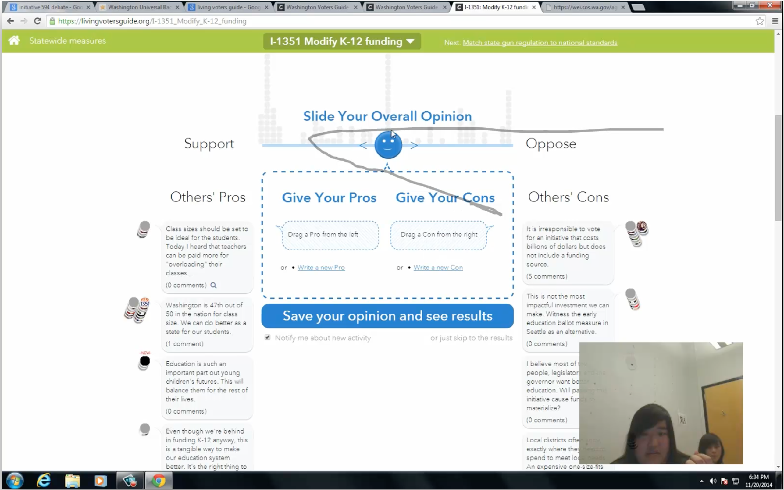
- Users do not immediately notice the filter options on the right of the graph page, especially users who support a measure. We recommend enlarging the filter options and moving them to the center of the page, underneath the opinion chart.
View our entire report here
The Team Long Dihn Megan Taylor Amy Wang Jennifer Wong
Document Final Report
Tools Used Usability Testing Lab Morae Google Form